Why Does Atlanta Community Food Bank Call This an Impact Report?
The Atlanta Community Food Bank seems to use its impact report email less as a gateway to deeper transparency and more as a fundraising touchpoint.
The Read · Issue 01 · April 2026
Over roughly 12 months, I reviewed 60–70 emails from Atlanta Community Food Bank (ACFB), read the Field Note here. One, sent on March 19, 2026, stood out: an email framed as “Your Impact Report is Ready!” What I found was that ACFB seems to use its impact report in this email less as a gateway to deeper transparency and more as a fundraising touchpoint.
The email is framed as a delivery of the donor’s 2025 impact report. That framing creates an expectation of something fuller, something that feels more reflective, more detailed, and more complete. But the actual experience is much shorter.
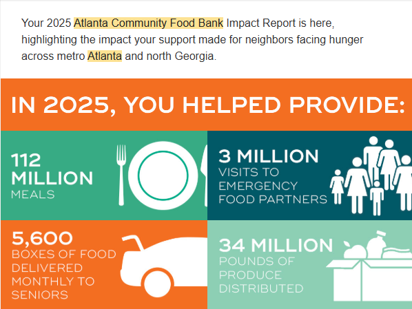
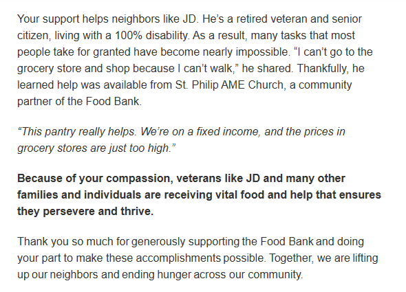
Instead of sending the reader into a long report, the email presents four large statistics tied to the organization’s impact, followed by a short story about a neighbor living with 100% disability who is able to access food through a local church partnership. After that, the email includes a thank-you from leadership, a matching gift reminder, and a Give Now button.

Atlanta Community Food Bank’s email, 2025 Impact Report stats, sent March 19, 2026
Clicking through leads directly to a donation page, not to a longer report experience. The organization does have a full 2025 annual report. It lives in the reports section of the website alongside financial statements and audit reports. Someone who wants more detail can absolutely find it. But that is not where the email sends people.
That feels like the most important choice in the whole experience. The organization had every opportunity to send people deeper into the report, and it very clearly chose not to.
The sequence is simple: you made an impact, here is proof, the need continues, your gift will go twice as far, give again.
The organization is not simply sharing impact. It is using impact to reassure the donor, then moving quickly toward the next gift. That is not necessarily a bad thing. In fact, it may reflect a pretty realistic understanding of donor behavior.
Most people are probably not going to read a long annual report in an email. Honestly, I do not blame them. Most of us are opening email quickly, often on our phones, between meetings, in line somewhere, or while trying to get through too many unread messages. What people may want instead is a quick confirmation that their support mattered, that the need is still urgent, and that giving again will help.
That makes this feel less like an annual report distribution and more like a condensed accountability-and-conversion flow.
What It Suggests
The organization seems to believe that most donors do not need a full report in order to feel confident giving again. They may just need proof that their support mattered, one memorable story, a few clear statistics, reassurance that the need still exists, and an easy path to act.
That is a very different role for an impact report. Traditionally, annual reports are used to communicate transparency, stewardship, financials, and organizational performance in more detail. (Candid, 2023) Here, the impact report feels more like a trust-building wrapper around a fundraising ask. And I think it’s quite smart.
That distinction matters more to people inside nonprofits than it probably does to most donors. Most supporters are unlikely to stop and think about the difference between an annual report and an impact report. They may sense that one feels heavier and more formal, while the other feels more accessible and easier to engage with. Or they don’t give it any thought at all.
But the language choice does make this interesting. The organization refers to the email as an “impact report,” while separately maintaining a “2025 annual report” within its reports section. As an insider, that distinction feels deliberate.
“Annual report” sounds more formal. It suggests financials, governance, operations, and board-level detail. “Impact report” feels softer, more emotional, more donor-facing, and more focused on outcomes and stories.
Adding the year, “2025 impact report,” creates even more ambiguity. It sounds complete and substantial, reflective of a traditional annual report, even though the actual experience is very different. And because nonprofits use these terms differently, many donors probably do not have a fixed idea of what the difference is anyway. Honestly, I would guess many practitioners don’t either.
All of this works in the organization’s favor. The phrase “impact report” gives the email credibility and weight, while still feeling approachable and easy to engage with. It sounds important, but not intimidating.
In practice, ACFB may really be creating two different versions of accountability. One version is deeper and more formal. That version lives in the reports section of the website and is likely more relevant for major donors, foundations, corporate partners, government funders, board members, and others who expect more detail on financials, operations, and outcomes.
The other version appears to be built for growing support from everyday supporters and the broader email list. It is shorter, easier to skim, and designed to create enough confidence to keep someone moving toward another gift, volunteer action, or other forms of engagement.
What Might Be Happening Behind the Scenes
This approach may reflect the reality that long-form reports do not perform especially well in email. Email is a low-attention channel. Nonprofits average roughly a 28.6% email open rate and about a 3.3% click-through rate (Nonprofit Tech for Good, 2025). That means most supporters never make it far beyond the first layer of content.
In that environment, a short and emotionally clear experience may simply work better than sending people into a longer report. Most of us are making split-second decisions in email.
Email still matters, but it has become harder to raise money through it. Recent benchmark data shows nonprofits raised about 58 dollars for every 1,000 fundraising emails sent in 2024, which was a decline from the year before. (M+R Benchmarks, 2024). That creates more pressure for organizations to make every click count.
There is also an internal reality to all of this. Many communications teams are navigating leaders who feel obligated to “send the annual report to everyone” and long-standing habits that are hard to question, even when email data suggests most people are not reading long reports in depth. (Nonprofit Tech for Good, 2025; Candid, 2023.) Gaining the autonomy to test shorter formats, segment audiences, or shift from full reports to condensed impact snapshots can be difficult when teams are already stretched thin and when “we’ve always done it this way” feels safer than trying something new. (See also Candid’s annual report guidance, 2023.)
It also helps explain why matching gifts show up so often in their communications. From the small sample reviewed (roughly 60-70 emails within 12 months), matching language appears frequently enough to feel like one of the organization’s core urgency devices rather than an occasional tactic. That lines up with broader donor behavior. Research shows that 84% of donors are more likely to give if a match is offered, and that matching gift appeals tend to increase both response rates and average donation size. (Double the Donation, 2026)
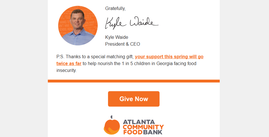
Atlanta Community Food Bank’s email, 2025 Impact Report, Matching gift ask, sent March 19, 2026
The donation page follows the same logic as the email. It is simple. It is child-centered. It is built around the match. The page is not trying to teach the donor more. It is trying to make it easy for the donor to act. By the time someone gets there, the organization may believe the decision has already been made.
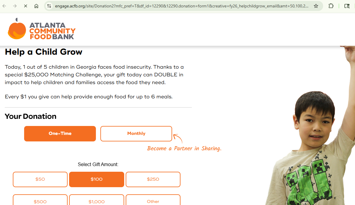
Atlanta Community Food Bank, donation page interface, April 2026
Questions I’m Left With
If organizations are finding that donors respond better to condensed proof of impact than to fuller reports, what happens to the role of annual reporting? Part of me wishes the annual report would become the one document nonprofits use across the board to communicate outcomes, not just to donors but across grant reports and stakeholder reporting too. Right now, organizations are often recreating the same information in different ways for different audiences.
Will more nonprofits start creating two versions of accountability, one built for transparency and review and another built for reassurance and conversion?
And if so, when supporters hear the phrase “impact report,” what will they expect it to mean? At some point, “report” starts to do a lot of work here. This experience is much closer to a fundraising touchpoint than what most people would traditionally think of as a report.
For your organization
If you’re sending “impact report” emails, a few questions and simple tests might help:
When you call something an “impact report,” what are you actually sending people into— a fuller reporting experience or a condensed accountability-and-conversion flow?
Over a few campaigns, try alternating formats (even without fancy testing tools): in some emails, keep donors inside a short, email-native “impact snapshot”; in others, send them to a longer report. Watch what happens to open rate, click-through rate, and completed gifts, not just one metric in isolation.
Experiment with subject lines that lean into “report” language (“Your 2025 impact report”) versus more direct language (“Your 2025 impact, at a glance”) and see which version actually gets more people to open and act.
Look at who really needs the long form. Are you asking your general email audience to do more work than they have capacity for, when a shorter, emotionally clear experience might serve them better?
You do not need a complex experimentation plan to learn something useful here. A few intentional variations over time can tell you a lot about how your supporters want to receive proof of impact.