What Happens When a Nonprofit Designs a Page Specifically for Kids
charity: water Tiny Heroes page showing audience-specific design, storytelling, and participation pathways for children, April 2026
charity: water, Observed April 2026
Interface: Tiny Heroes Page (Take Action section)
Lens: Create Belonging
Pattern: Child-Centered Participation Design
Key Signal
The interface shifts its visual language, structure, and storytelling to speak directly to children as active participants.
Why It Matters
Participation expands when organizations design for who is actually engaging, not just who is expected to give.
Observation
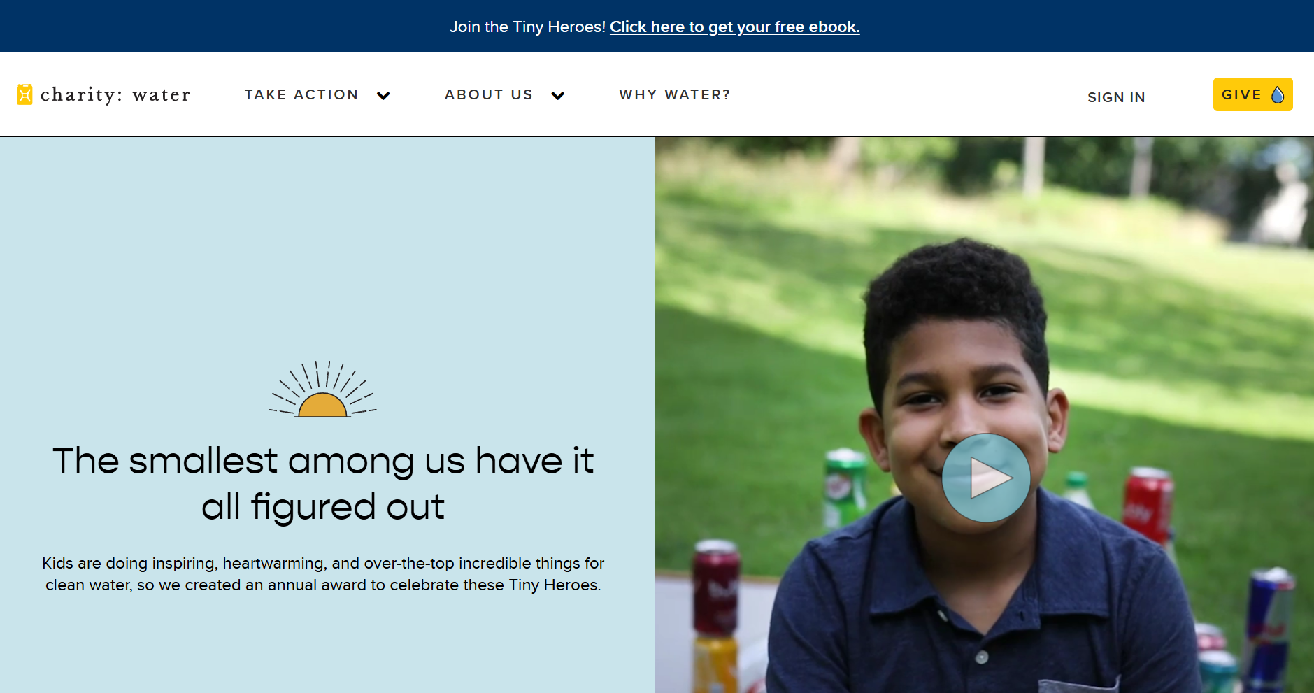
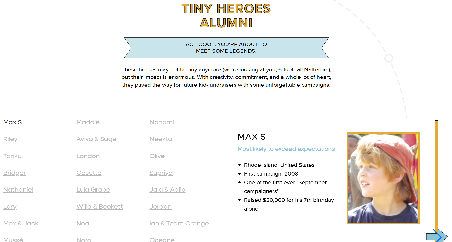
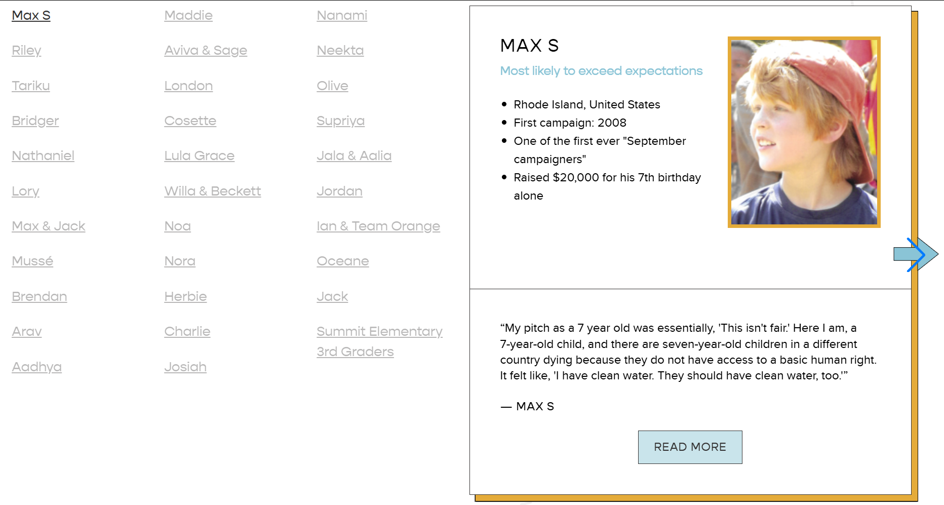
Within the “Take Action” section, charity: water introduces a dedicated experience for younger participants through its Tiny Heroes page.
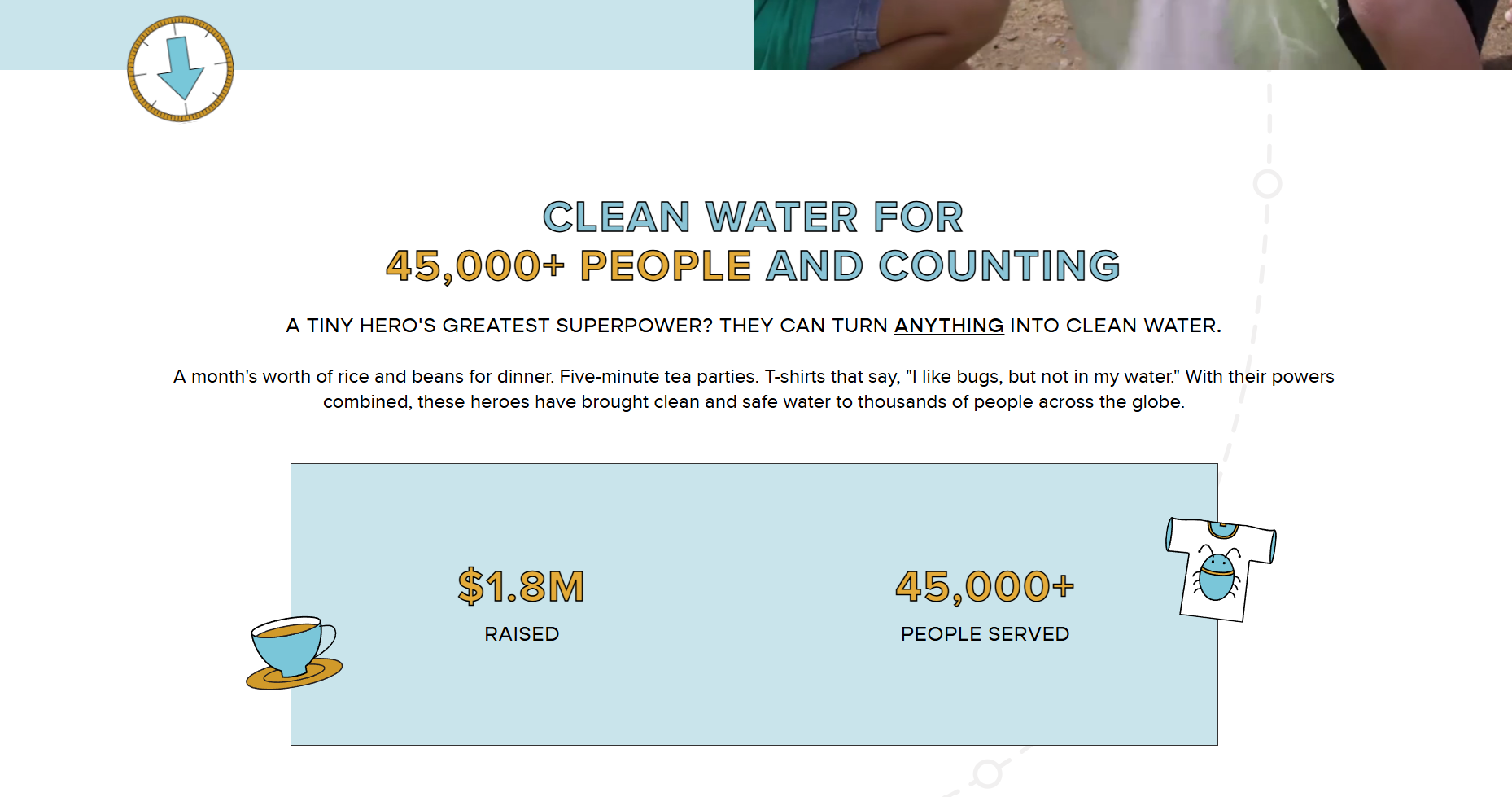
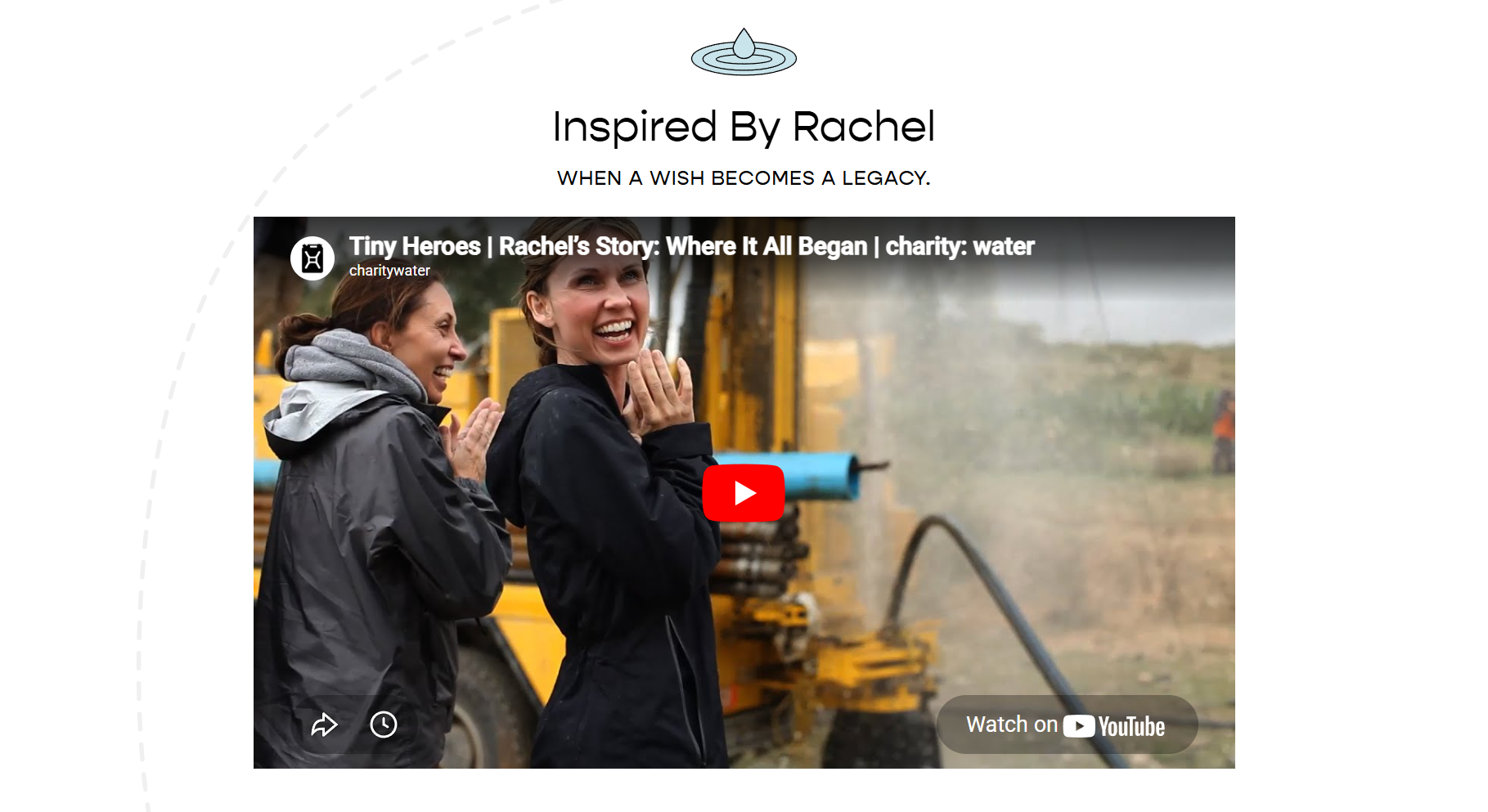
The shift is immediate. They don’t just offer a toolkit or explainer video for kids. The visual design becomes lighter and more playful. Soft blues and yellows replace the more restrained brand palette. Illustrated elements, directional graphics, and motion cues guide the user through the page. Typography becomes more expressive.
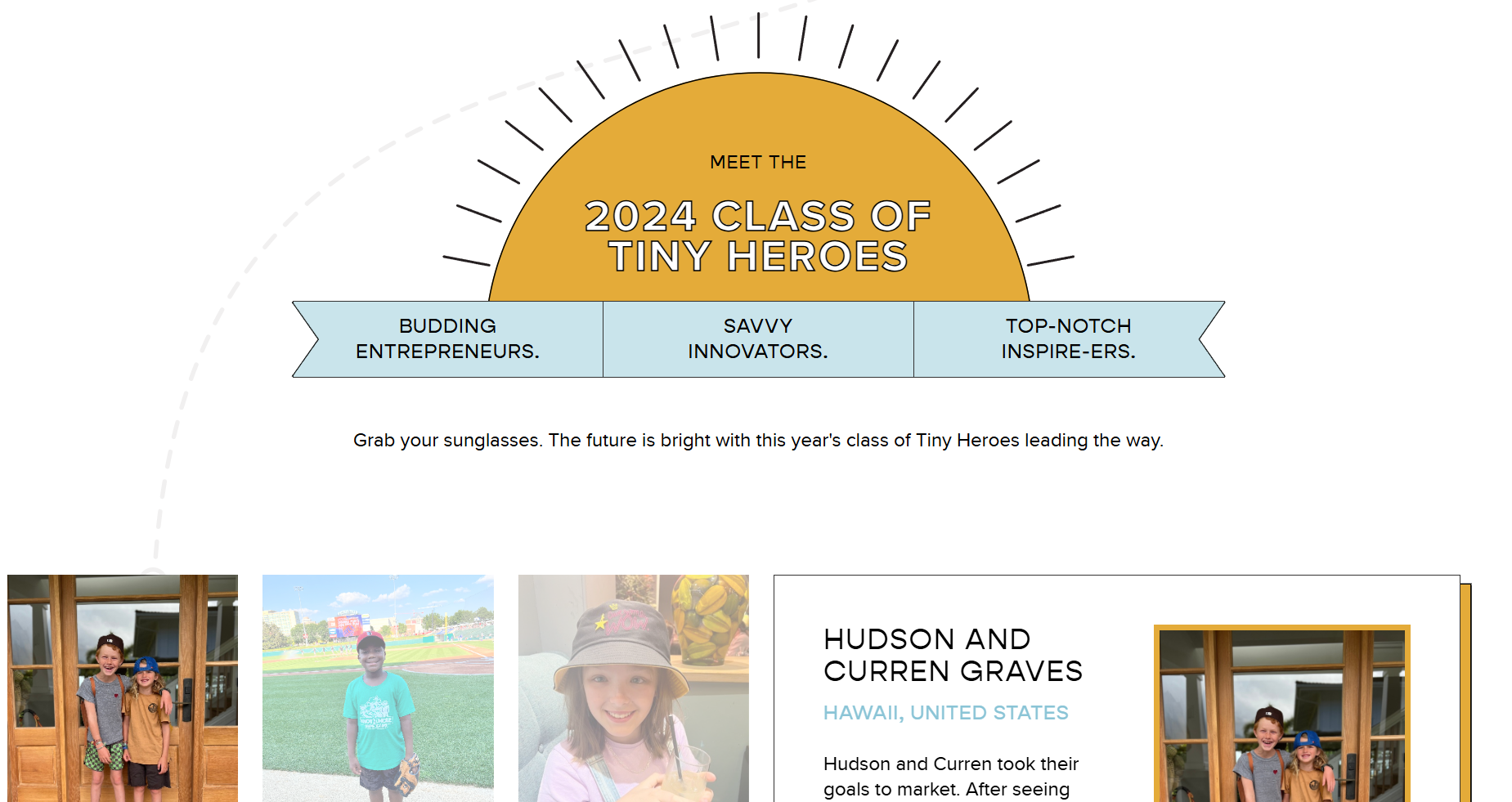
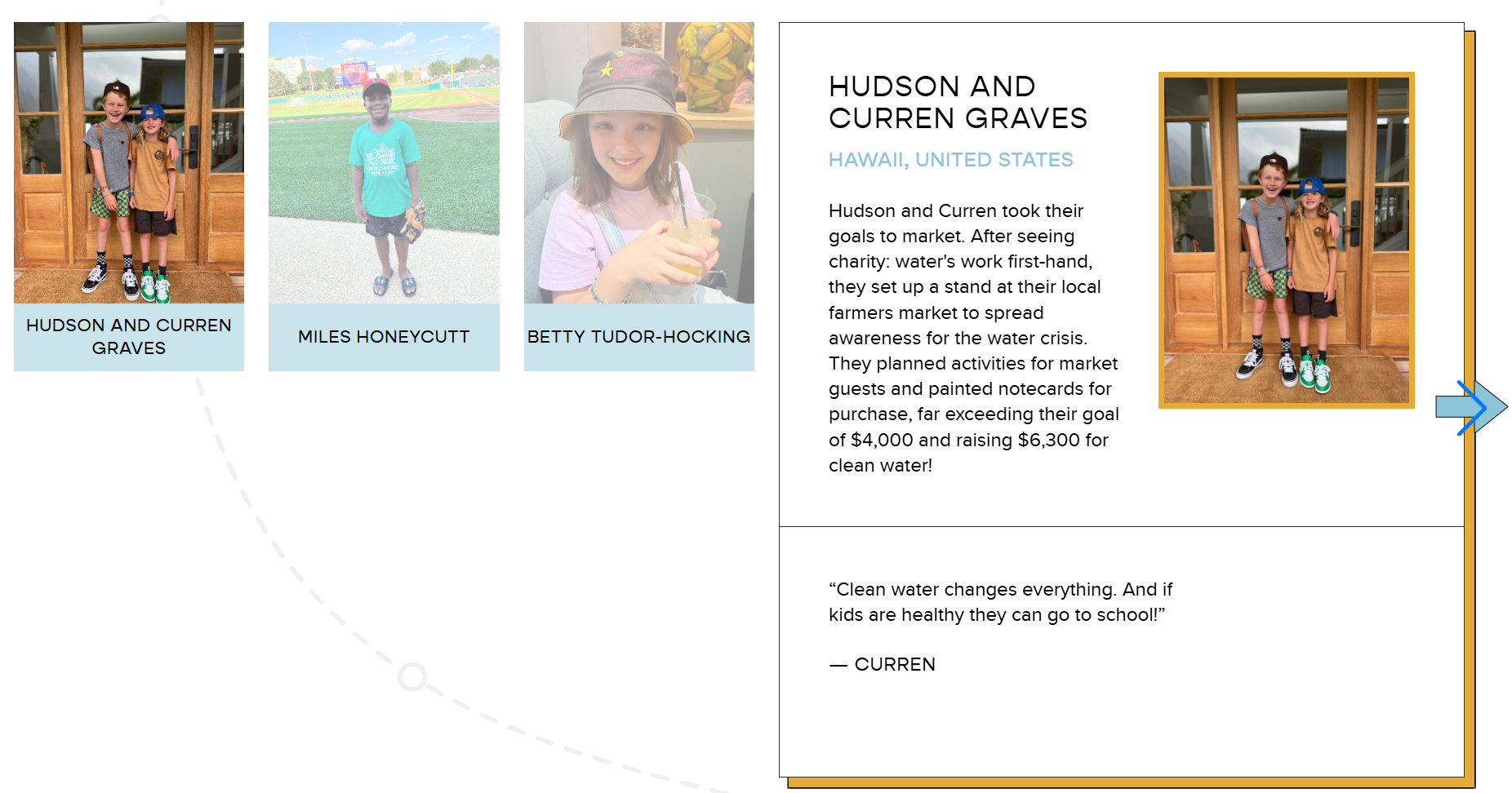
The content shifts as well. Videos and images feature children actively participating in fundraising efforts. Stories are told from their perspective, often in their own words.
Navigation is structured differently. Instead of presenting a single action, the page offers multiple entry points. Learn, explore, start something of your own. It meets kids where they’re at.
The experience is not just simplified. It’s reoriented to kids.
Why It Matters
Most nonprofit digital experiences are designed for a single assumed user. The adult donor. This page expands that assumption.
Instead of asking parents to interpret and translate the experience for their children, the interface speaks directly to the child as a potential participant. The messaging, visuals, and structure all reinforce that they are not just observers of the work. They are capable of contributing to it.
This changes the role of the user.
Participation becomes something that can begin earlier, feel more accessible, and carry a different kind of ownership.
Why This Works
Adapts visual language to match the intended audience
Uses peer representation to normalize participation
Breaks the experience into multiple approachable entry points
Maintains brand continuity while shifting tone and structure
Positions children as active contributors, not secondary audiences
What I’m Watching
Whether organizations move beyond labeling audiences or creating a single asset to designing fully distinct participation experiences, where visuals, pathways, and actions are intentionally built around how different groups actually engage. In particular, whether “this is for kids” continues to be treated as a messaging decision, or becomes a design decision that reshapes how participation actually happens.