Community Solutions Built an Interactive Map That Explains How Homelessness Ends


Community Solutions Built for Zero interactive map and Columbia-Boone County community profile, April 2026
Community Solutions, Observed April 2026
Interface: Built for Zero page, interactive map + community profile
Lens: Explain the Work
Pattern: Layered Impact Navigation
Key Signal
The map moves users from national scale to community-level process, structuring impact as something that can be explored, not just stated.
Why It Matters
The map supports a bold claim — that homelessness is solvable — by showing how communities are actually working toward that outcome.
Observation
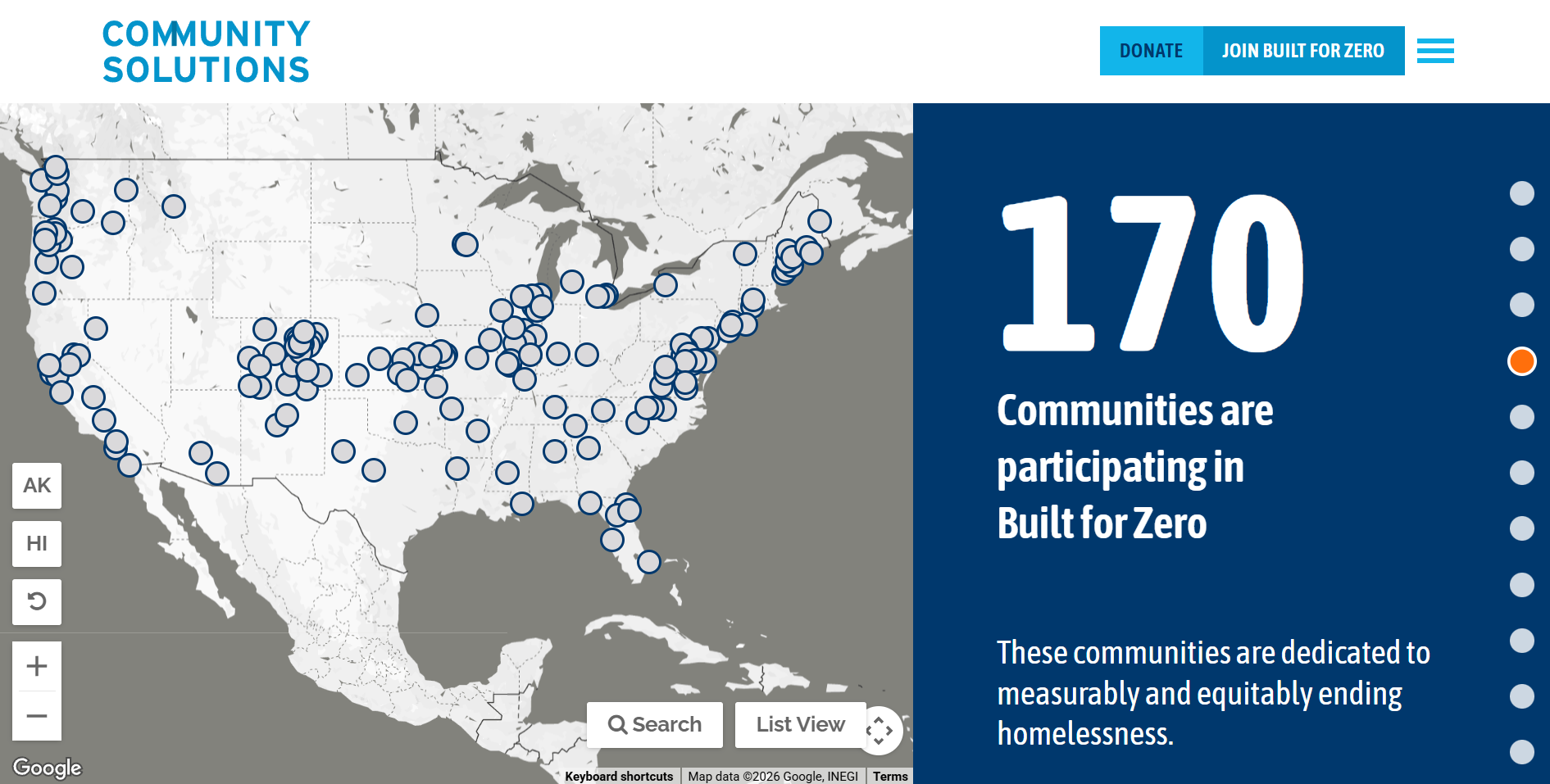
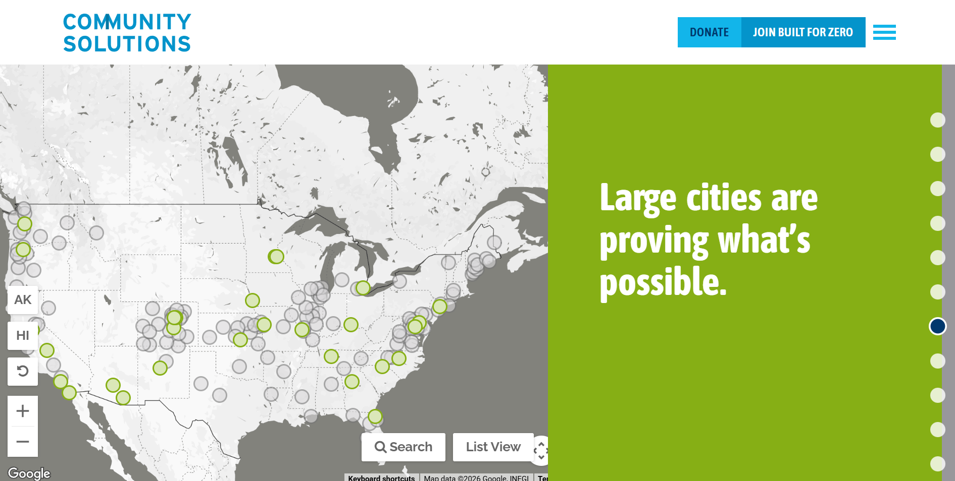
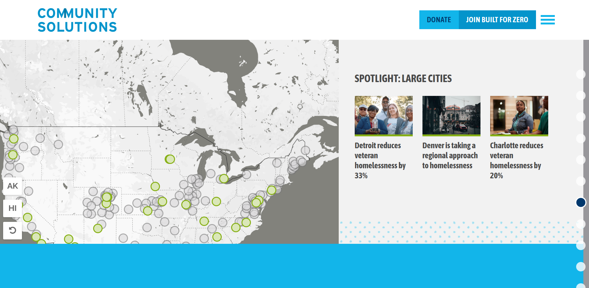
A few scrolls into Community Solutions’ Built for Zero page, an interactive map appears alongside a series of changing panels. At first glance, the map reads as a familiar signal of scale. It shows dots across the country, a count of participating communities, and a broad sense of reach.
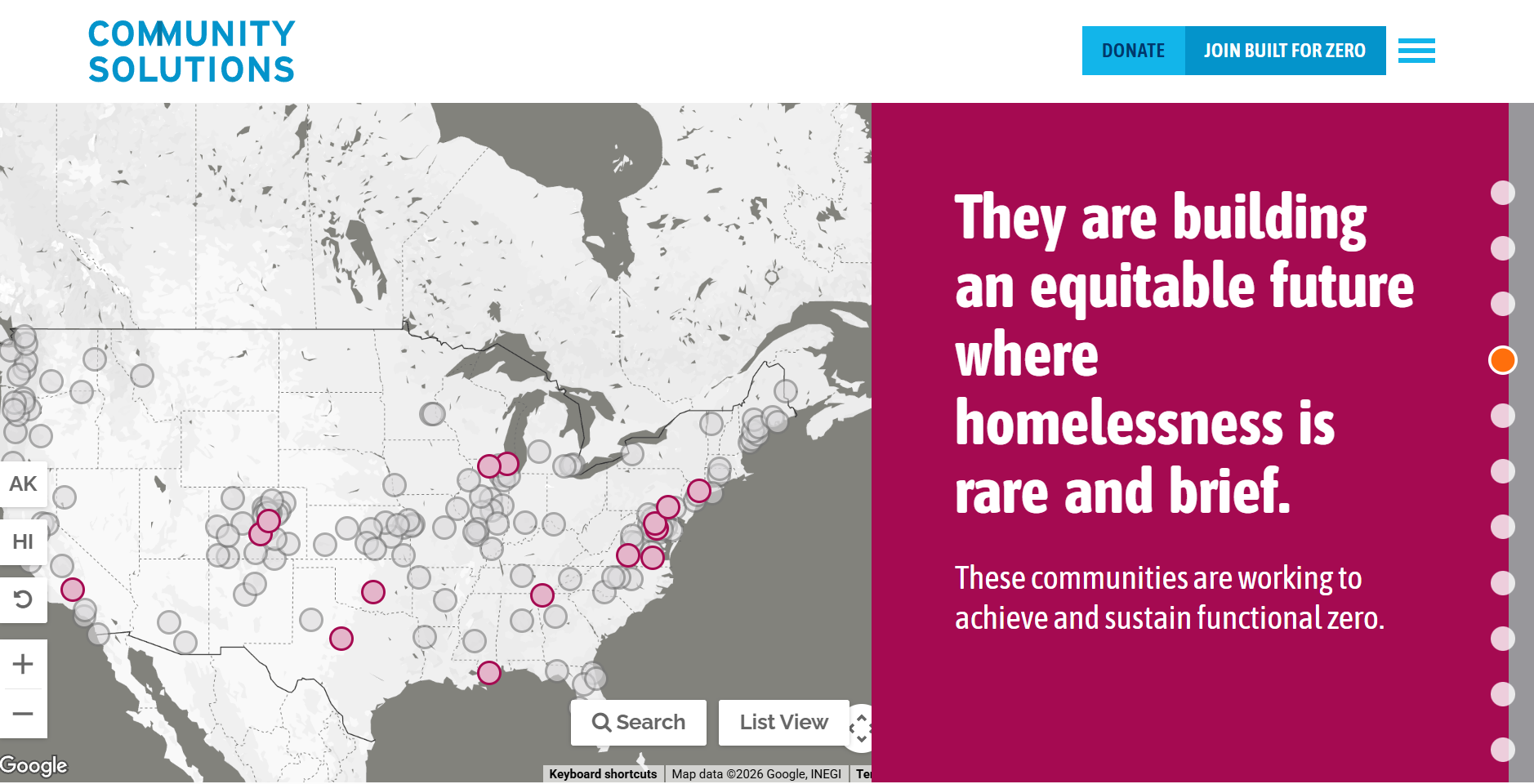
As users move through the page, the experience begins to layer in context. The panels alongside the map introduce key concepts such as functional zero, measurable reduction, and progress across different types of communities. The map is not presented as a standalone visual. It’s paired with a structured sequence that explains how the organization defines success and how progress is measured.
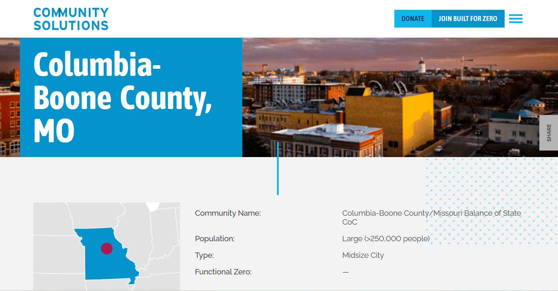
User interaction then introduces another layer. Selecting a community reveals a standardized summary with fields such as population, type, and status. From there, users can move into a deeper community profile.
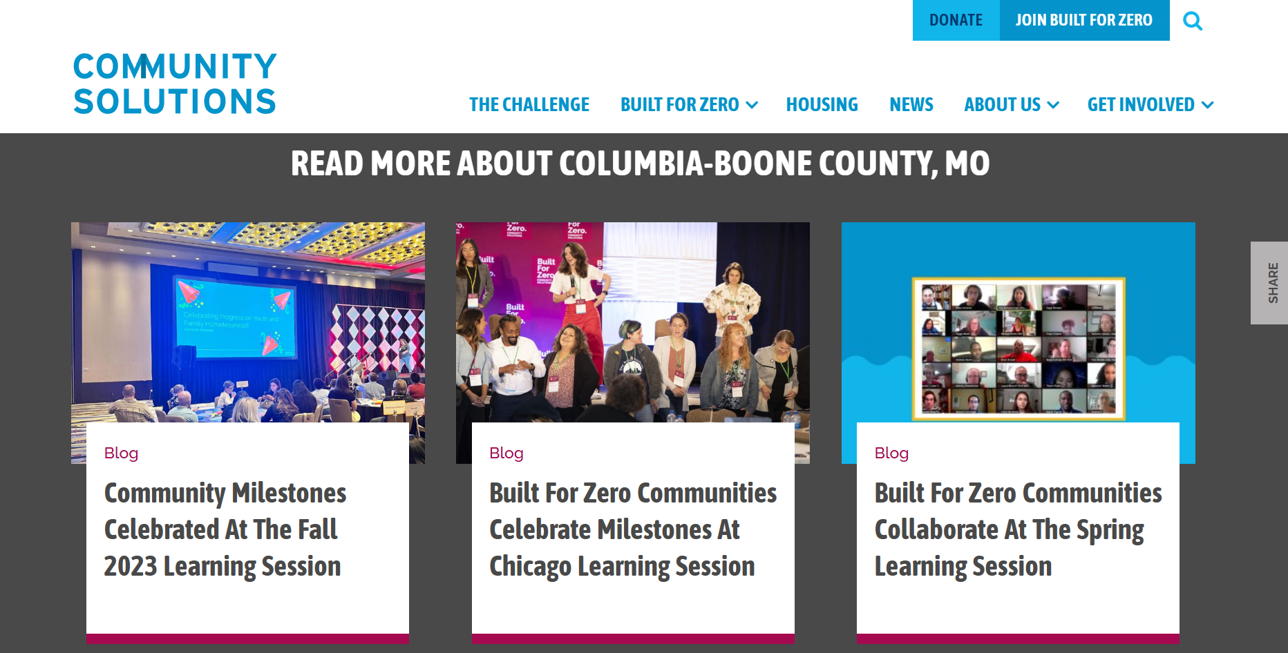
In the Columbia-Boone County example, the experience shifts from orientation to a more detailed record of local work. The page includes a timeline of milestones, the development of by-name data, and other indicators of system progress over time. The emphasis is not only on outcomes, but on the work required to achieve them. The interface moves from scale to place to process.
Why It Matters
Community Solutions makes a clear claim: Homelessness is solvable. The map experience helps carry the weight of that claim. Rather than relying only on statements or aggregate outcomes, the interface shows how different communities define success, build systems, and make measurable progress over time. It acknowledges that the work is complex and that solutions are locally shaped, while still reinforcing that progress is possible within a shared framework.
This, in effect, shifts the role of the map. It’s not only showing where work is happening. It is helping explain how a coordinated approach across communities can lead to a specific outcome. The result: The user is not only told that something is solvable, they’re given a way to examine how that solution is being built.
Why This Works
Starts with scale, then allows optional depth
Uses interaction to answer unspoken user questions
Connects abstract impact to verifiable evidence
Makes verification feel accessible, not technical
Reinforces messaging through interface design, not repetition
What I’m Watching
Whether organizations making system-level claims increasingly rely on interactive experiences to demonstrate how those claims hold across different contexts.
Will maps and similar interfaces become standard tools for showing how complex, locally driven work adds up to a broader outcome.
I’m also watching how this level of depth functions for different audiences. Whether it strengthens credibility by showing the work in detail, or creates distance for users who may not engage beyond the initial layer.