How a Height Chart Became a Communication Tool About Youth Homelessness


We Are Mobilise, OOC/Experiential, Observed May 2026
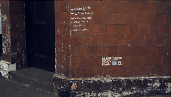
We Are Mobilise + Droga5 ANZ, part of Accenture Song, OOC/Experiential, Observed May 2026
Interface: OOC/Experiential
Lens: Explain the Work
Pattern: Assumption Disruption Through Familiar Objects
Key Signal
The campaign used hand-drawn childhood height charts on street walls to make youth homelessness visible through something people usually associate with safety, stability, and home.
Why It Matters
Some of the strongest nonprofit communication works by disrupting an assumption people may not even realize they hold.
Observation
In April 2026, We Are Mobilise partnered with Droga5 to mark Youth Homelessness Matters Day with a public installation across street walls in Sydney and Melbourne.
The installation used hand-drawn childhood height charts placed directly onto exterior walls and public surfaces throughout the city. Each chart looked like the pencil markings many families make inside their homes to track a child’s growth over time. The markings included ages between four and twelve and were paired with one clear line of copy: “No child should grow up on the streets.”
Several installations also included QR codes beneath the height markings, giving people a direct path to learn more and support the campaign.
The visual approach was intentionally simple. The charts looked hand-drawn, not polished or overly produced. They appeared on concrete walls, alley walls, and worn public surfaces. In several campaign photos, the markings sit at a child’s height, making the scale of the child feel physically present in the space.
The campaign centered on the statistic that 28,948 children in Australia are without stable housing. Supporting copy named forms of homelessness that are often less visible, including couch-surfing, temporary accommodation, and living in vehicles.
Instead of relying on long explanations, the campaign used the contrast between a familiar childhood image and the public places where it appeared.
Why It Matters
Youth homelessness can be difficult to communicate because much of it is not immediately visible. Many children without stable housing are not sleeping in places the public usually associates with homelessness. They may be moving between temporary homes, staying with relatives, sleeping in vehicles, or couch-surfing from one unstable situation to another.
This campaign makes that hidden instability easier to feel.
A childhood height chart is usually connected to home. It suggests care, routine, safety, and the expectation that a child will stay in one place long enough for their growth to be marked over time.
By placing that image on public walls, the campaign changes its meaning. Something associated with home appears in a place that feels exposed, temporary, and unprotected. The viewer understands the tension quickly, even before reading the statistic or scanning the QR code.
The wall is not just a surface for the message. It helps create the message. The location gives the campaign its emotional weight.
That is what makes the installation effective. It turns an issue that can feel distant or abstract into something people can recognize immediately: a child growing up without the stability that childhood should include.
Why This Works
The campaign uses an object people already understand emotionally. A height chart carries familiar associations with home, care, stability, childhood, and permanence.
It creates emotional tension before the viewer has to process the data. The placement does a lot of the work.
It narrows a broad social issue into one specific childhood ritual.
It uses contrast instead of heavy explanation. The familiar image and the public setting tell the story together.
The QR code gives people a next step at the moment they are most likely to care.
What I'm Watching
I’m watching whether more nonprofit campaigns use familiar objects, rituals, or everyday environments to make overlooked issues feel newly visible through contrast, displacement, or interruption.
Source: Campaign details, installation descriptions, QR code references, and supporting statistics sourced from coverage of “No Place To Grow” by LBB Online, Campaign Brief, Creative Review, Marketing-Interactive, Famous Campaigns, Marketech APAC, and campaign imagery/posts observed April–May 2026 via @wearemobilise Instagram. Reported campaign details include hand-drawn height chart installations across Sydney and Melbourne, QR-code-enabled donation pathways, digital out-of-home amplification, and the statistic that 28,948 children in Australia are currently without stable housing.