The Tracker Wasn't New. The Placement Was.
Australian Red Cross Lifeblood, Instagram, Observed May 2026
Australian Red Cross Lifeblood, Instagram, Observed May 2026
Interface: Paid Media + Instagram
Lens: Build Trust
Pattern: Real-Time Urgency
Key Signal
The tracker already existed. The breakthrough was moving it somewhere people would actually see it.
Why It Matters
Many nonprofits already collect information that reflects real-time need. The challenge is making that urgency visible.
Observation
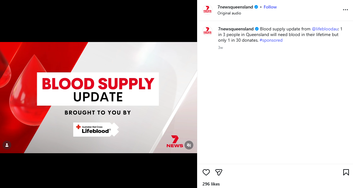
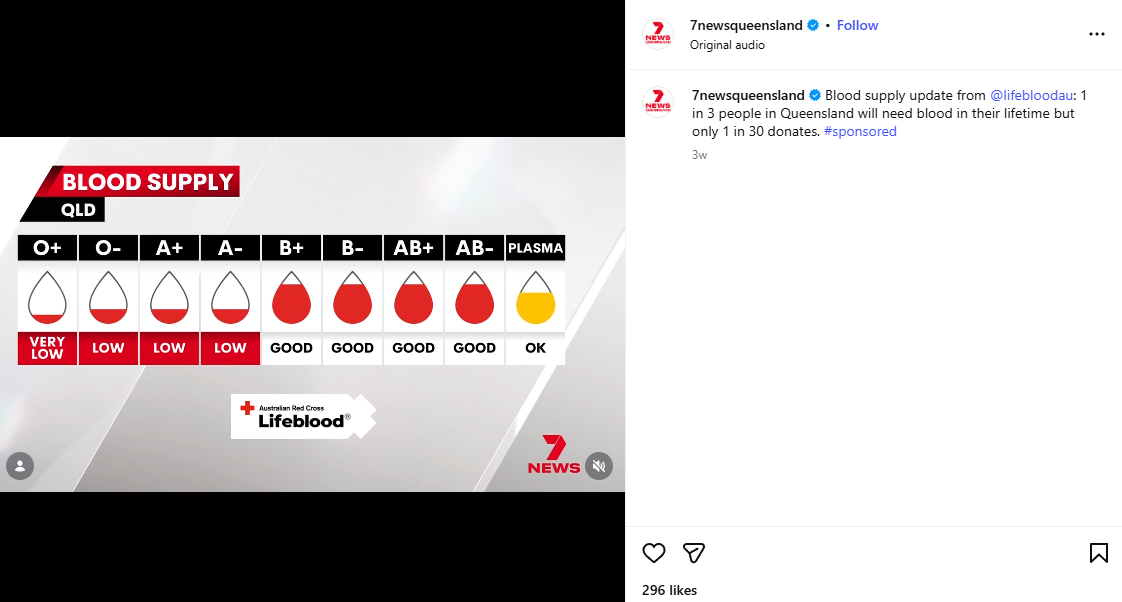
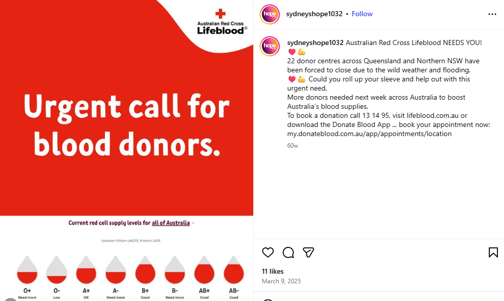
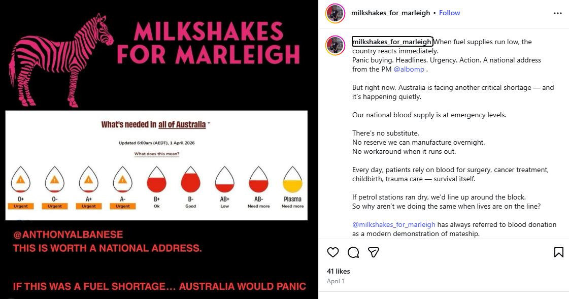
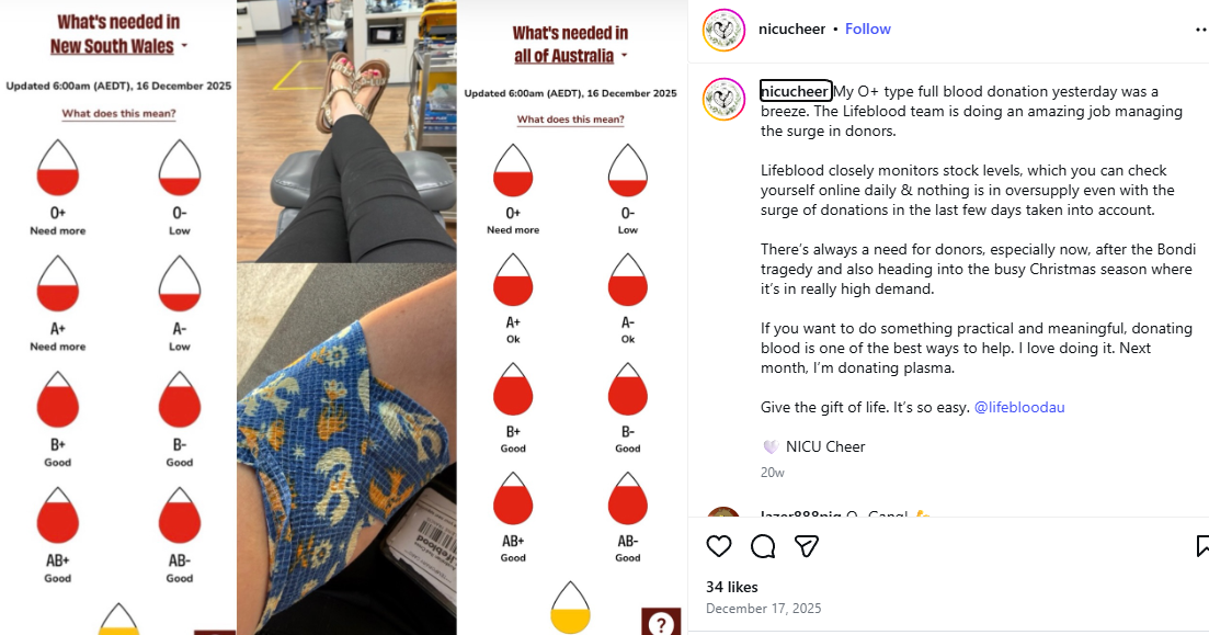
Australian Red Cross Lifeblood maintained a live blood supply tracker on its website. Updated daily, it showed current supply levels by blood type and state using simple indicators that signaled whether supply was critical, low, or stable. The information was accurate, timely, and consequential. But it lived on a website.
The agency Clemenger BBDO recognized that the tracker wasn't just a website feature. It could be a recurring public-interest update.
Through a partnership with Australia's largest television network, Seven, blood supply levels became part of Tuesday Nightly News broadcasts across the country. Local anchors delivered state-specific updates using graphics that resembled the threat-level systems Australians already relied on to make decisions about weather and emergencies.
The campaign extended beyond the nightly news through AFL sponsorships, streaming integrations, QR codes, television spots, and digital placements. But the most interesting part of the strategy wasn't the media buy. It was the decision to treat operational data as public information. The campaign simply moved it into places where people were already paying attention.
The idea also traveled beyond paid media. Community members began sharing screenshots of the tracker on social media alongside their own donation stories. One user compared blood shortages to fuel shortages, arguing that if Australians understood the scale of the problem, public attention would look very different.
The message spread because the graphic was easy to understand and the underlying problem was already compelling.
Why It Matters
Most nonprofit communications lead with the solution: Donate. Volunteer. Foster. Sign up. The ask often sits at the front, and the problem lives in the body copy most people scroll past.
What this campaign demonstrated is that a different sequence can also be effective. When the problem is made specific, measurable, and visible in real time, the ask here becomes almost unnecessary because people can see the urgency of what is happening in real time.
And that’s the specific lesson I’m pulling out because not all data produces this effect. A total number of people served last year doesn't create urgency. A funding gap expressed as a percentage doesn't necessarily move people to act today. What worked here was data with three specific qualities: it shifted constantly, it carried life-critical stakes, and it was granular enough to feel local and immediate.
That combination is what made the tracker a news story. News doesn't cover static conditions. It covers changing ones. The blood supply tracker behaved like news because the underlying reality it was measuring behaved like news.
The broadcast partnership gave this logic scale and authority. But the logic itself doesn't require a broadcast partner. A recurring social post that shows current need, updates on a predictable schedule, and is simple enough to read in two seconds works on Instagram the same way it worked on Channel 7. And for followers who see it regularly, it becomes something they expect, something they check, something they share when the numbers look bad. It’s now a communication habit built around real conditions.
Why This Works
The tracker reflected changing conditions rather than static outcomes.
The urgency was inherent in the data and didn't need to be manufactured.
State and blood-type specificity made the issue feel immediate and relevant.
The visual could be understood in seconds.
The format looked like information rather than marketing.
Community members could easily share it without additional explanation.
What Nonprofits Without Broadcast Partners Can Steal
Although great, the broadcast deal isn’t the lesson. The lesson is what made the broadcast deal possible: data that shifts, stakes that are real, and a format simple enough to read in seconds.
If your organization tracks anything that changes on a regular basis, current need, beds available, families on a waitlist, meals left to distribute this week, children waiting for a mentor, animals without foster homes, that data is the asset. The question is whether it's visible and whether it's placed where people are already looking.
For organizations working without paid media budgets, social media is the broadcast equivalent. A recurring post, same visual format every time, published on a predictable schedule, showing a real number that reflects current conditions does the same work at a different scale. Followers who see it regularly begin to expect it. When the number looks bad, they share it. When they share it, it reaches people who weren't following. That is earned reach built on real information.
A few formats that apply the same logic:
Social media: A weekly or monthly post with a consistent visual structure showing current need against a target. Not a campaign graphic. Not a fundraising ask. A status update. The consistency is what makes it something people follow rather than scroll past.
Website: A live or regularly updated indicator on your homepage or donation page. A specific number. A status. Something that signals this is being tracked and the situation is changing.
Monthly or quarterly communications: A recurring section that reports current need the way a dashboard reports a metric. Readers who see it regularly begin to treat it as a check-in, not a solicitation.
The key in every format is that it has to read like information, not marketing. The Lifeblood tracker worked because it looked exactly like the threat-level graphics Australians already used to make decisions. When the format signals information, people engage with it as information. When it signals campaign, they scroll.
Your version doesn't need to be sophisticated. It needs to be consistent, specific, and designed to be understood at a glance.
What I'm Watching
Many organizations collect operational data that rarely leaves internal dashboards, like, waitlists, foster shortages, mentor demand, open shelter beds, food inventory, and volunteer capacity.
Most of that information never becomes part of public communications. What interests me about this example is the possibility that some of the most compelling nonprofit content already exists. It may simply be sitting inside systems designed for operations rather than engagement.
Source: Campaign strategy and impact figures sourced from Clemenger BBDO, "How a Media-First Turned Blood Donation Into National News," clemengerbbdo.com. Reported results: 15K registrations (355% increase), up to 28,848 lives saved, +22% increase in awareness. Instagram posts observed May 2026 via @lifebloodau, @7newsqueensland, @sunriseon7, @milkshakes_for_marleigh, @sydneyshope1032, @nicucheer, and @goldcoast.health.